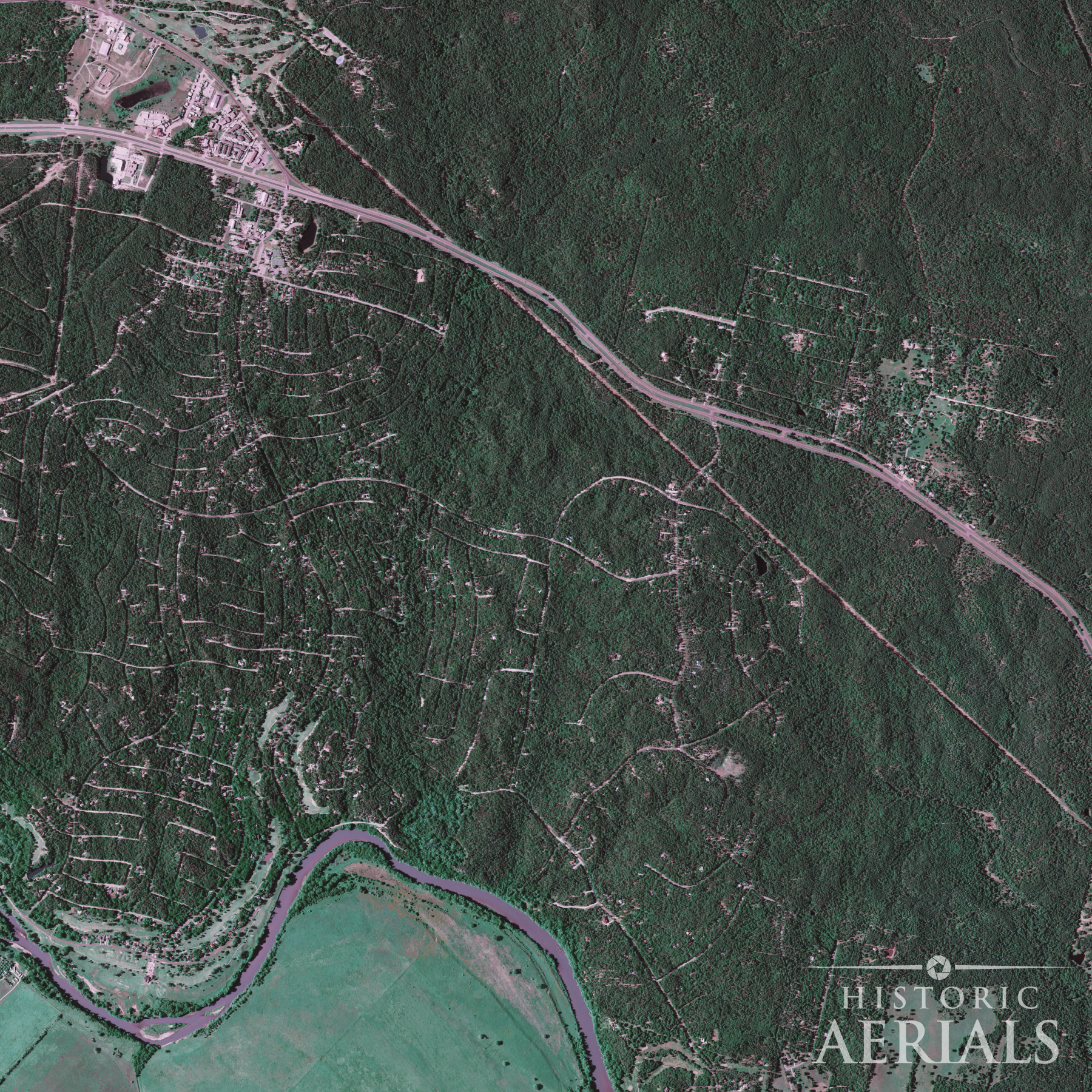
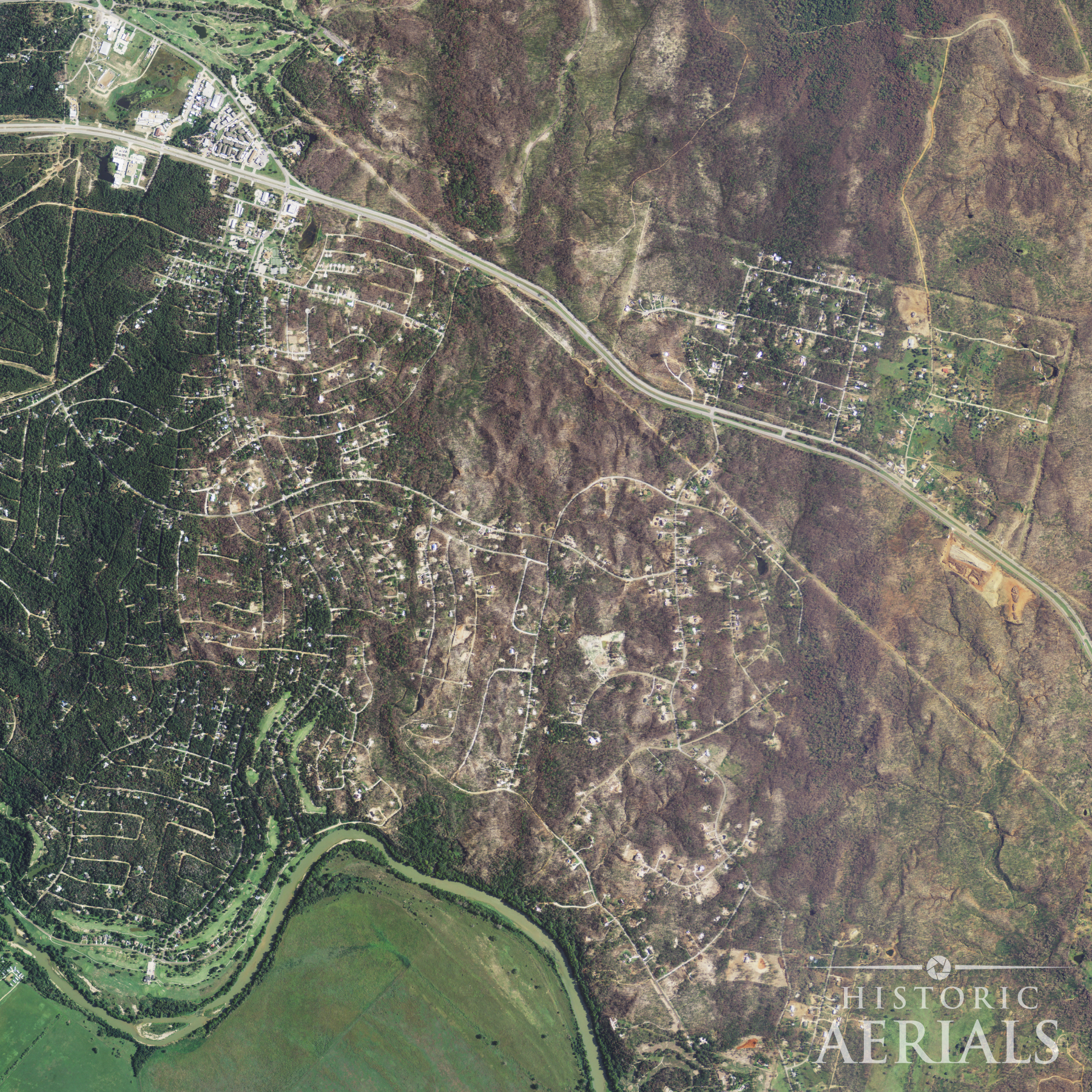
Many people remember the day Paradise burned. But fewer have seen what it looked like years before.
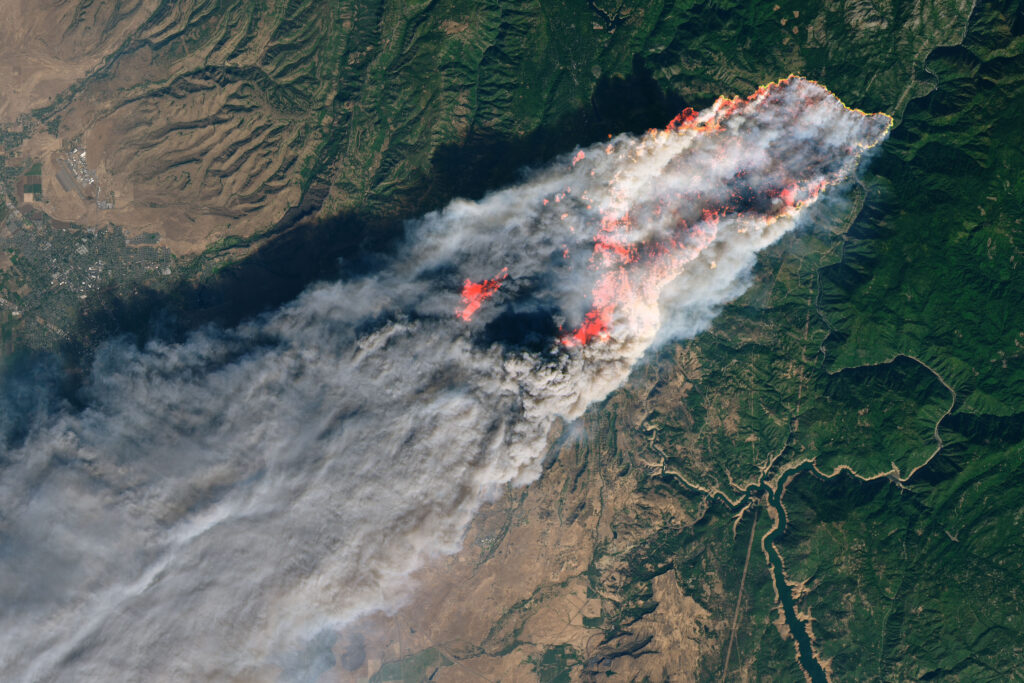
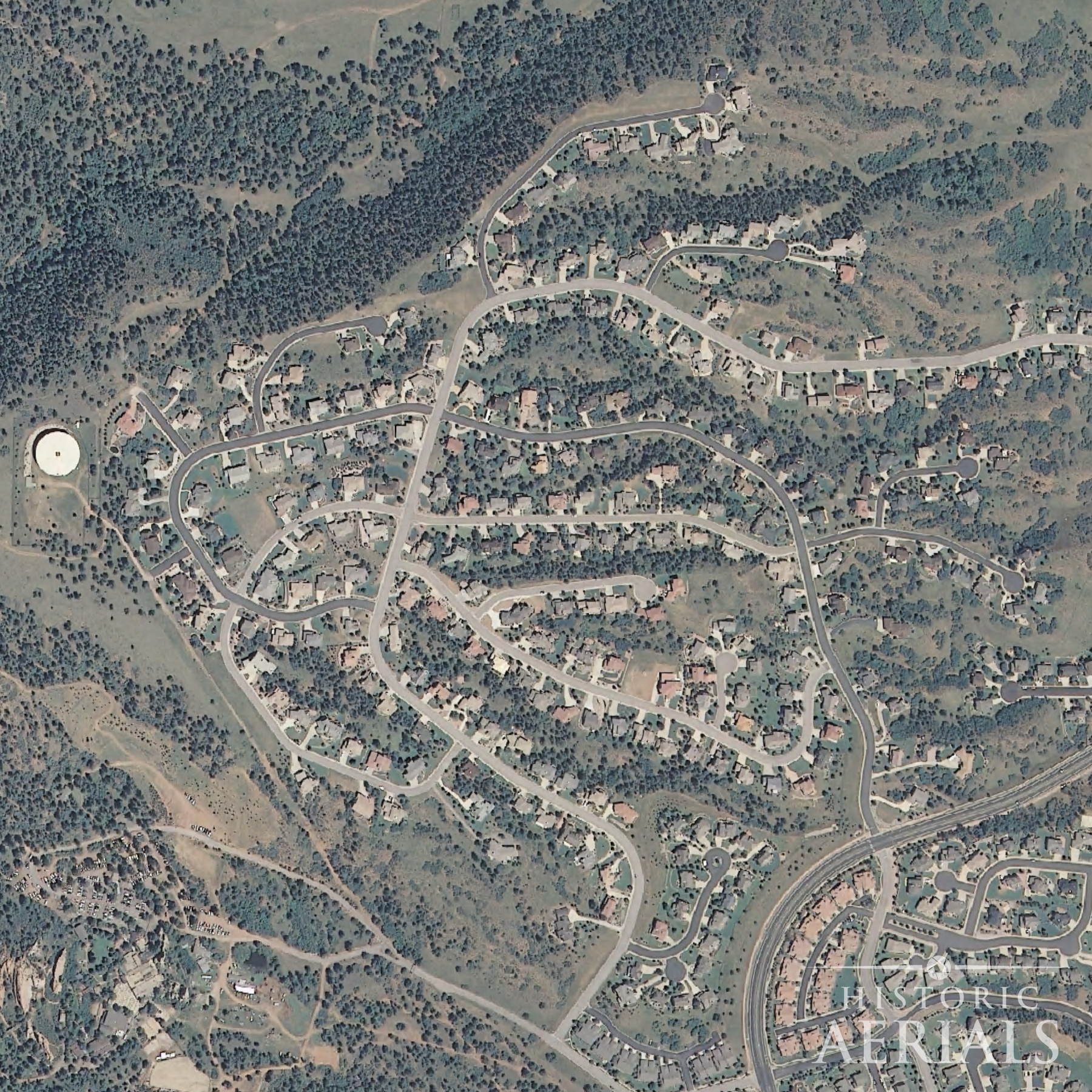
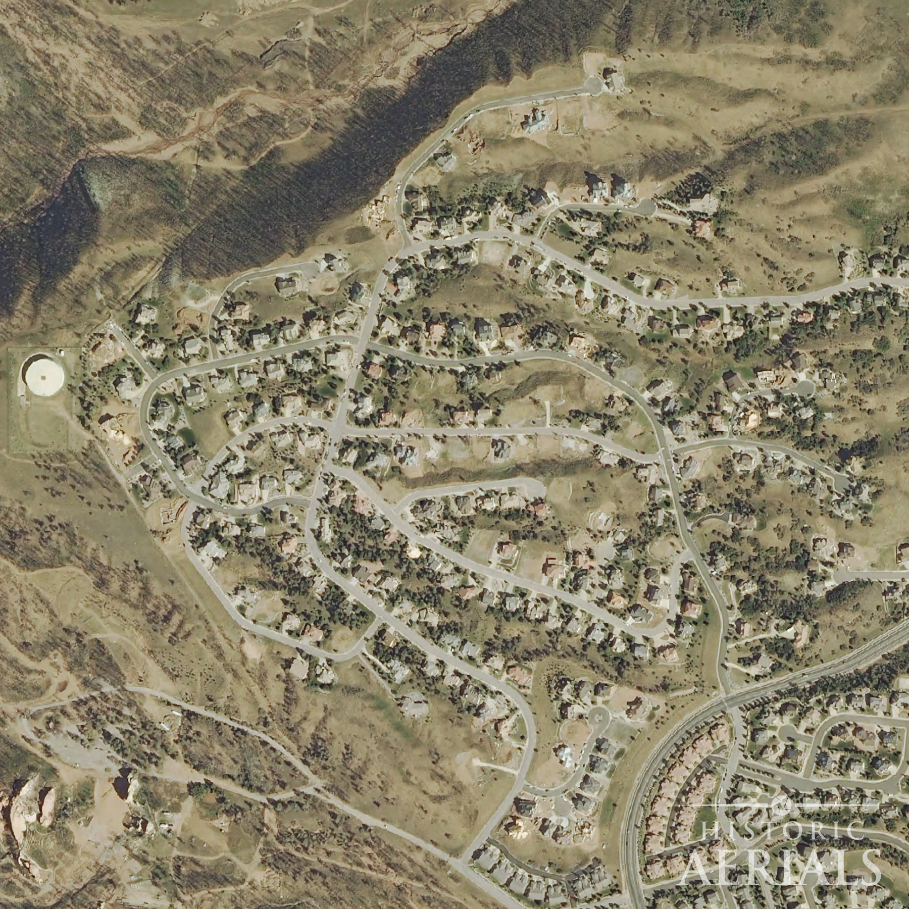
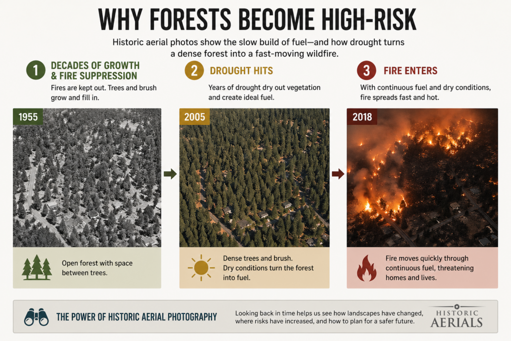
From above, the town didn’t look fragile. It looked settled. The neighborhoods were tucked into thick stands of trees, roads winding through dense vegetation that had been building for decades. Nothing about it felt temporary. But when the Camp Fire tore through in 2018, that same landscape became the mechanism of destruction.
Look closer, and you’ll see that the pattern was already there, years before the fires ever started.
What the imagery shows
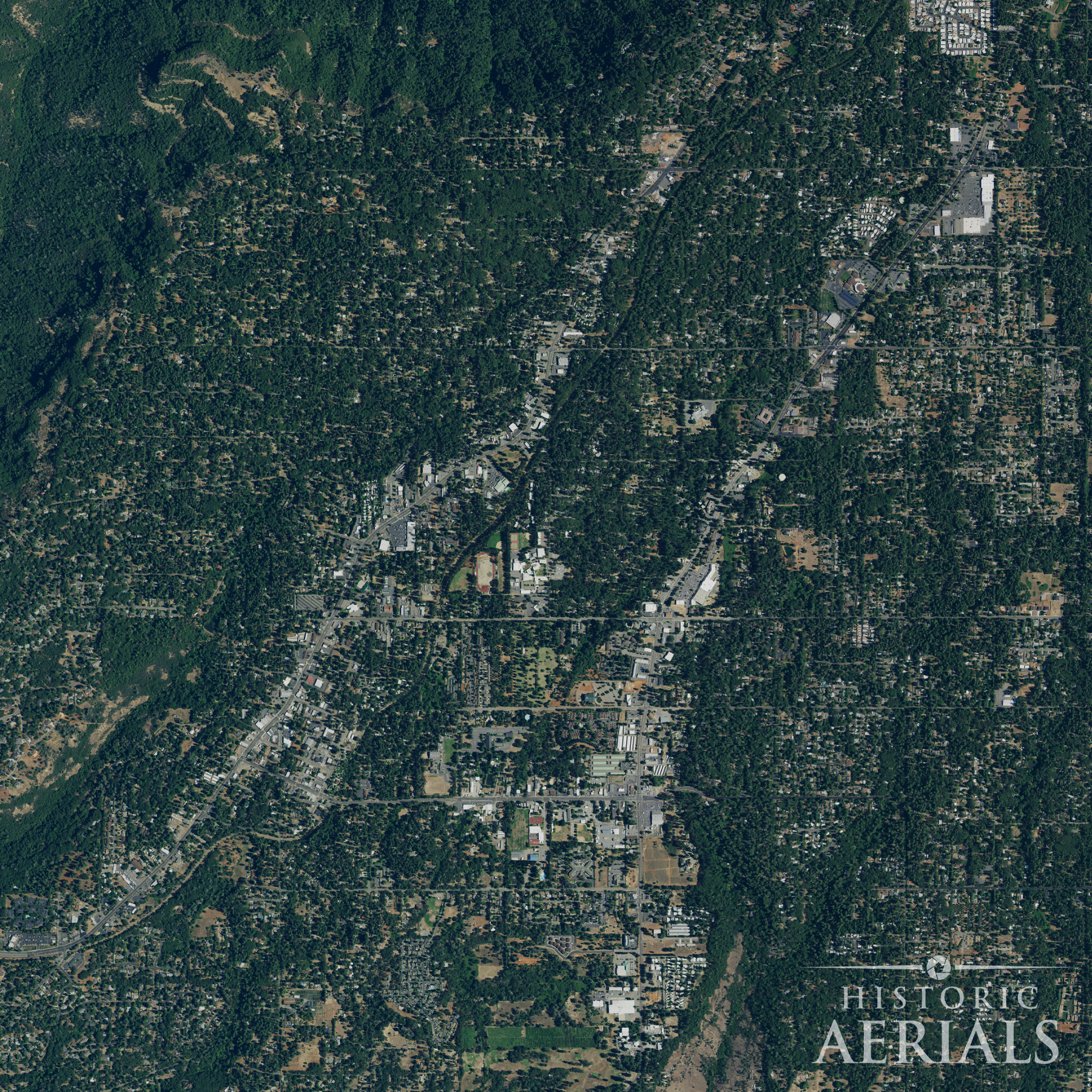
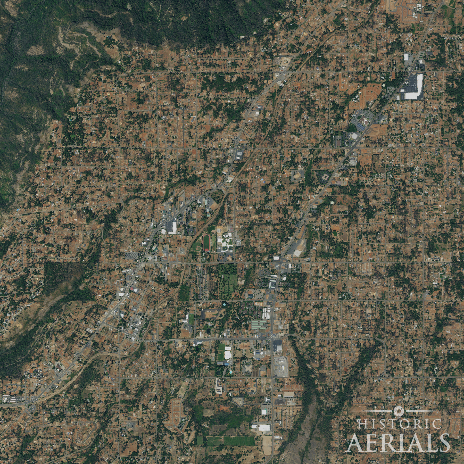
Historic aerial imagery makes that visible in a way reports and maps rarely do. When you step back through earlier decades, a pattern begins to emerge. Vegetation thickens. Open space narrows. Development pushes further into the wildland-urban interface. The change is gradual; almost unnoticeable year to year. But over time, it compounds.
The pattern across regions
Paradise isn’t unique.
In Bastrop, Texas, aerial imagery leading up to the 2011 Complex Fire shows pine forests that had grown increasingly dense over decades, then dried out under prolonged drought.
In Laguna Beach, California, homes expanded deeper into steep, brush-filled canyons before the 1993 fire.
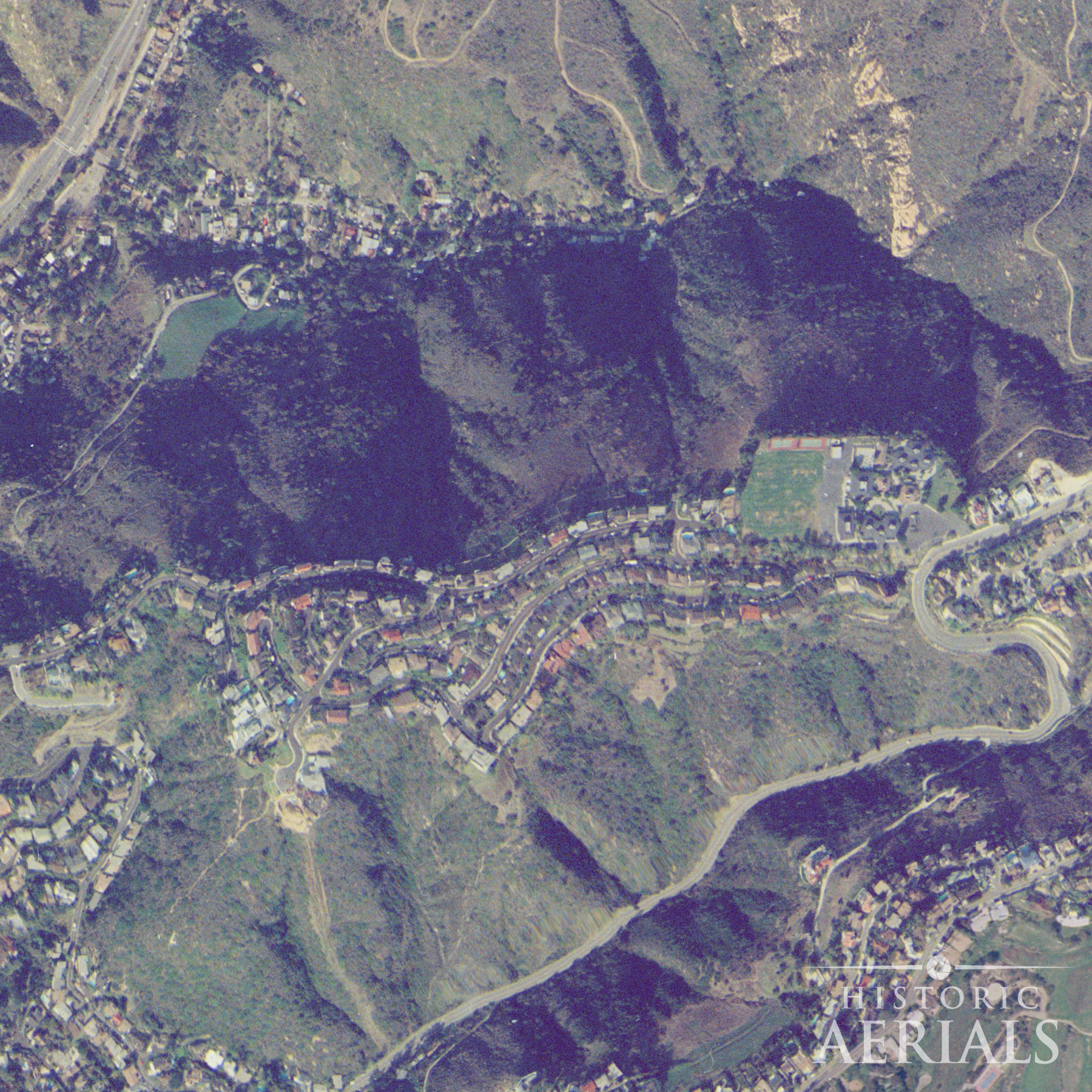
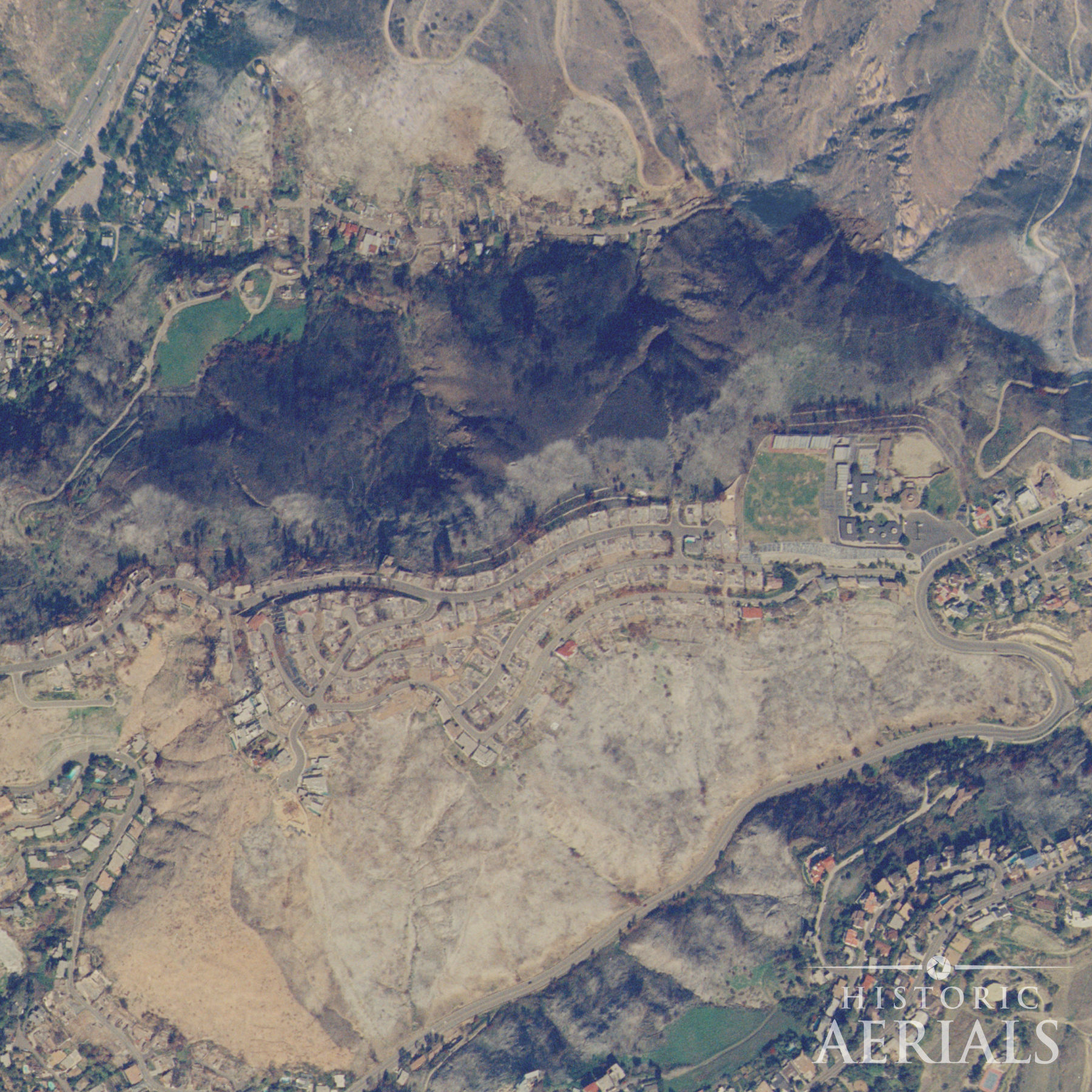
In Colorado Springs, the Waldo Canyon Fire of 2012 followed continuous fuel corridors that had been forming right up to the edges of suburban neighborhoods.
Different regions. Same pattern.
This isn’t speculation. Aerial surveys from agencies like the U.S. Department of Agriculture and the U.S. Geological Survey have documented land cover and development across the country for decades. Programs like the National Aerial Photography Program created a continuous visual record, one that can now be compared, layered, and analyzed over time.
Why it matters
And when you look at it that way wildfire risk becomes less abstract.
You can track vegetation density: where forests thicken or brush encroaches. You can see land use change: where housing and infrastructure expand into areas that once acted as buffers. You can even begin to understand how fires move, by comparing burn perimeters against earlier conditions.
That has practical consequences.
For planners and developers, it highlights where growth has increased exposure. For forestry professionals, it provides a baseline for evaluating fuel management. For homeowners, it offers a clearer picture of how their surroundings have changed, often in ways that aren’t obvious from the ground.
And for anyone making decisions about land, it raises a harder question.
How much of what we call “natural disaster” is the result of slow, visible change that we chose not to see?
Historic aerial imagery doesn’t predict the next fire. But it does something just as important: it shows, with uncomfortable clarity, how we got here.
Related articles